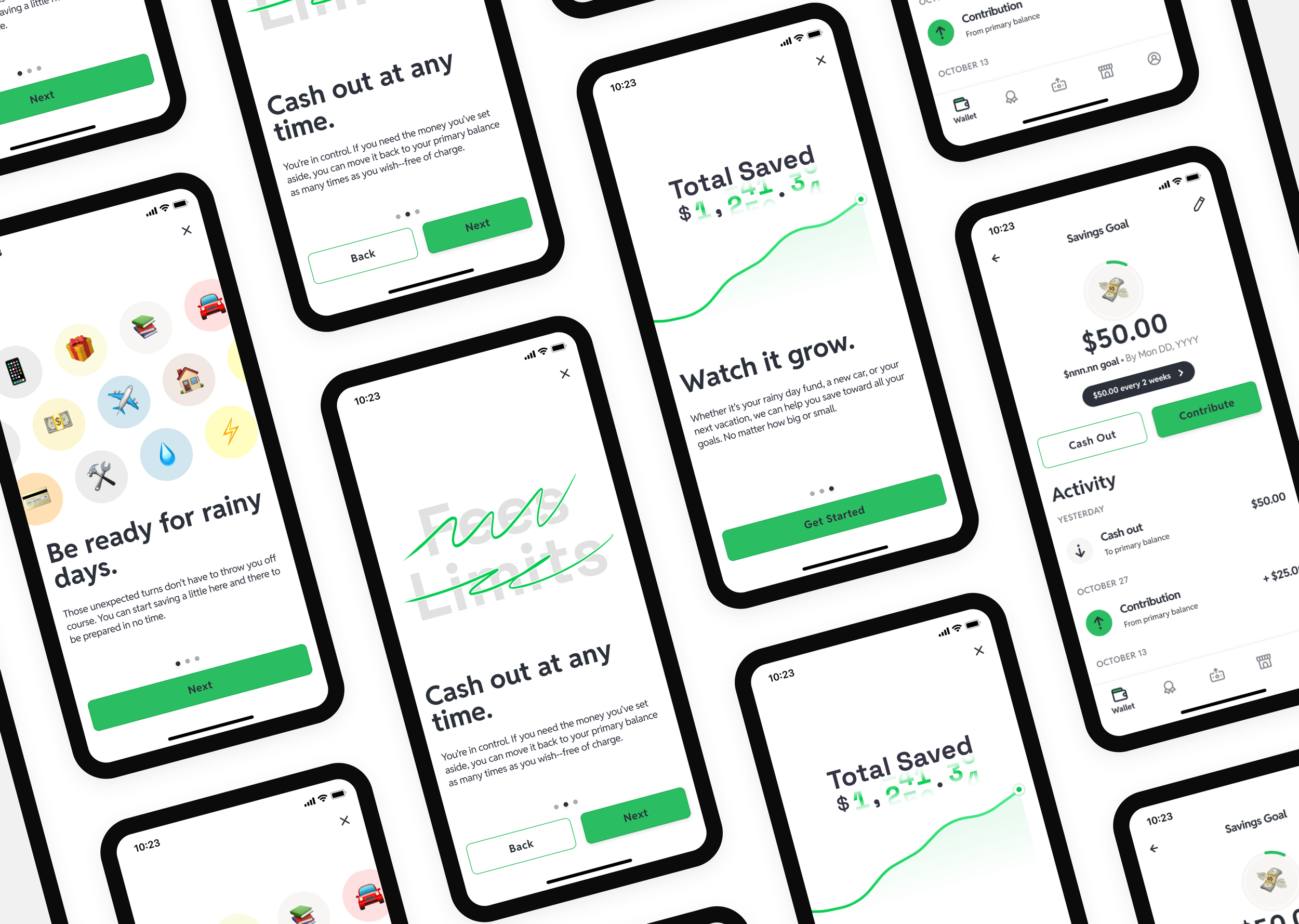
Savings Goals
Helping hourly workers build financial stability through a simple, in-app savings experience.
— Company
Branch
— Year
2023
— Role
Sole designer
— Project backgroundPutting savings where the money already is
For hourly and gig workers, saving money is not a priority problem. It is a proximity problem. The money lands in their Branch Wallet and moves out just as fast. There is no moment that feels like the right time to set it aside, and no place in the app that makes it easy to do so.
Research from Uber surfaced the same pattern across their driver population: gig workers wanted to save, but they needed flexibility. Their savings often doubled as an emergency fund. Any feature that locked money away or penalized withdrawals would fail before it started.
Branch saw an opportunity to close that gap with a simple, in-app savings experience that lived where the money already was.
One user, two contexts
Workers using Branch Wallet and workers using the Uber integration were effectively the same person with the same need: somewhere to put money that felt separate from spending, without it feeling inaccessible. The design had to work for both without requiring two different experiences.
My role
I was the lead designer on Savings Goals, working alongside product and engineering at Branch and building on top of research from Uber's team. I worked from Uber's findings, shaped the MVP scope with the PM, and designed the end-to-end flow from goal creation through contribution and withdrawal.
Three decisions that shaped the feature
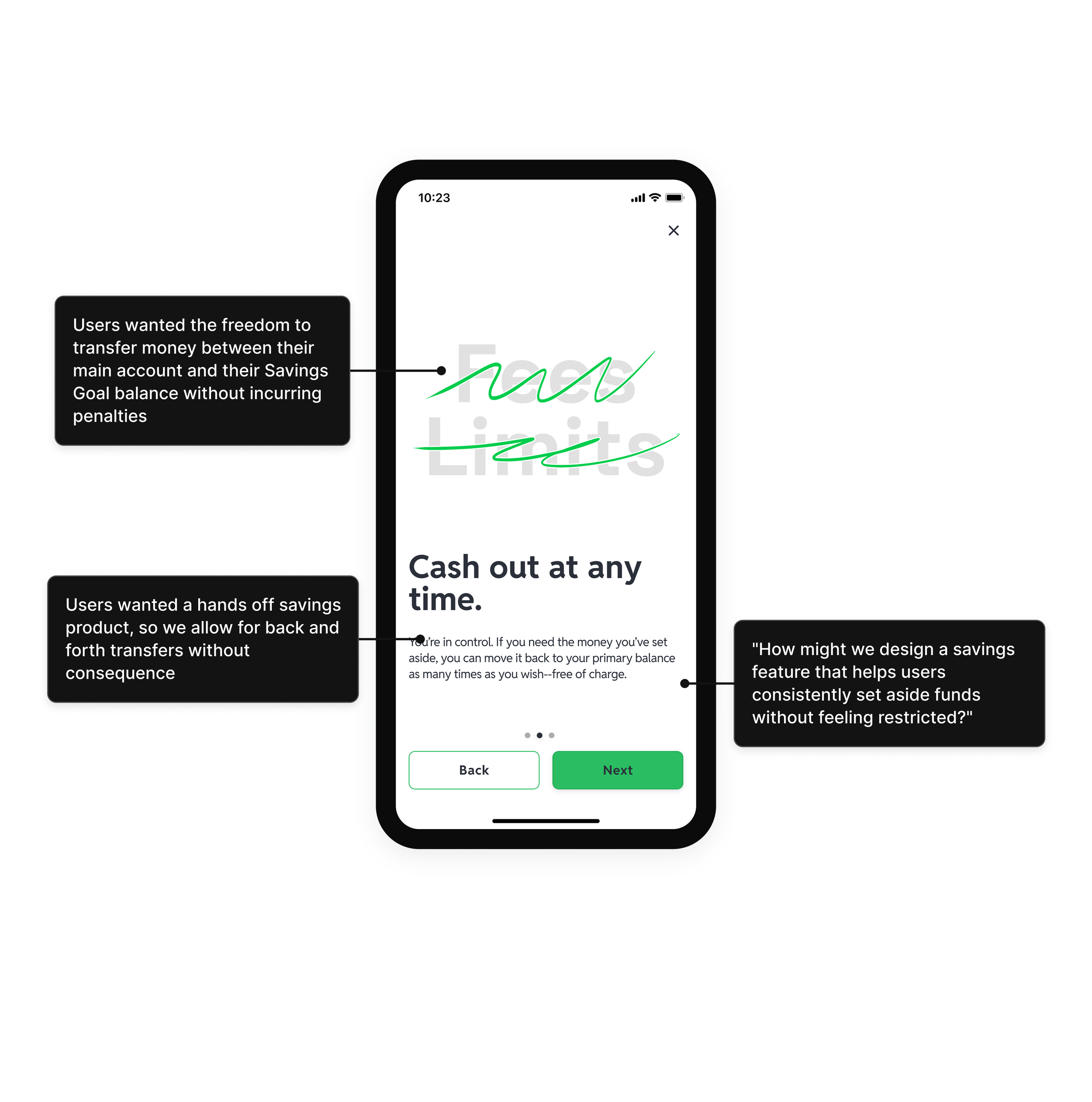
Savings that felt separate but not locked
The core tension was psychological. Workers needed to feel like their savings were set aside, otherwise they would spend it. But any friction around getting the money back would kill trust. The solution was a dedicated savings balance with no penalties and no waiting period on withdrawals. The separation was visual and structural, not mechanical.
Cutting automation to ship something that worked
The original scope included auto-contributions, round-ups, and multiple concurrent goals. None of it made the MVP. The decision to cut was not about resources. It was about not asking users to configure a savings product before they trusted it. A single goal, manual contributions, and a progress bar was enough to prove the concept and build the habit. Automation could come after.
Protecting against negative balances without creating friction
Workers moving money in and out freely created a risk of overdrawing their primary balance. The solution was withdrawal rules that checked available balance before allowing a transfer, surfaced clearly in the UI without blocking the action when the balance was sufficient. It protected users without making them feel managed.
Feature ranking survey, Uber driver population. Users ranked 6 features by priority (1 = most important).


Outcome
In the first four weeks after launch, 40% of users who tapped "Save Funds" created a goal. 41% of those contributed funds. 49% set a specific target amount. Monthly active users increased 10%. Withdrawals from the primary account dropped 8%.
The MAU increase was the headline metric, but the withdrawal reduction was the more interesting signal. It suggested users were actually changing behavior, moving money into savings rather than spending it.
What is next
The MVP intentionally deferred automation, round-ups, and multiple concurrent goals. Those were not cut because they were not valuable. They were cut because asking users to configure a savings product before they trusted it would have hurt adoption. The future state prototype explores what the experience looks like once that trust is established.
What I learned
Savings features for lower-income users live or die on trust. Any design decision that feels like a restriction will cause users to disengage before they see the benefit. The job was to make saving feel like a natural extension of spending, not a separate financial product they had to opt into.