Rewards Revamp
Redesigning the rewards experience to make offer discovery clearer and more actionable for workers.
— Company
Branch
— Timeline
2023
— Role
Lead designer
— The problem
When users don’t know what they’re missing
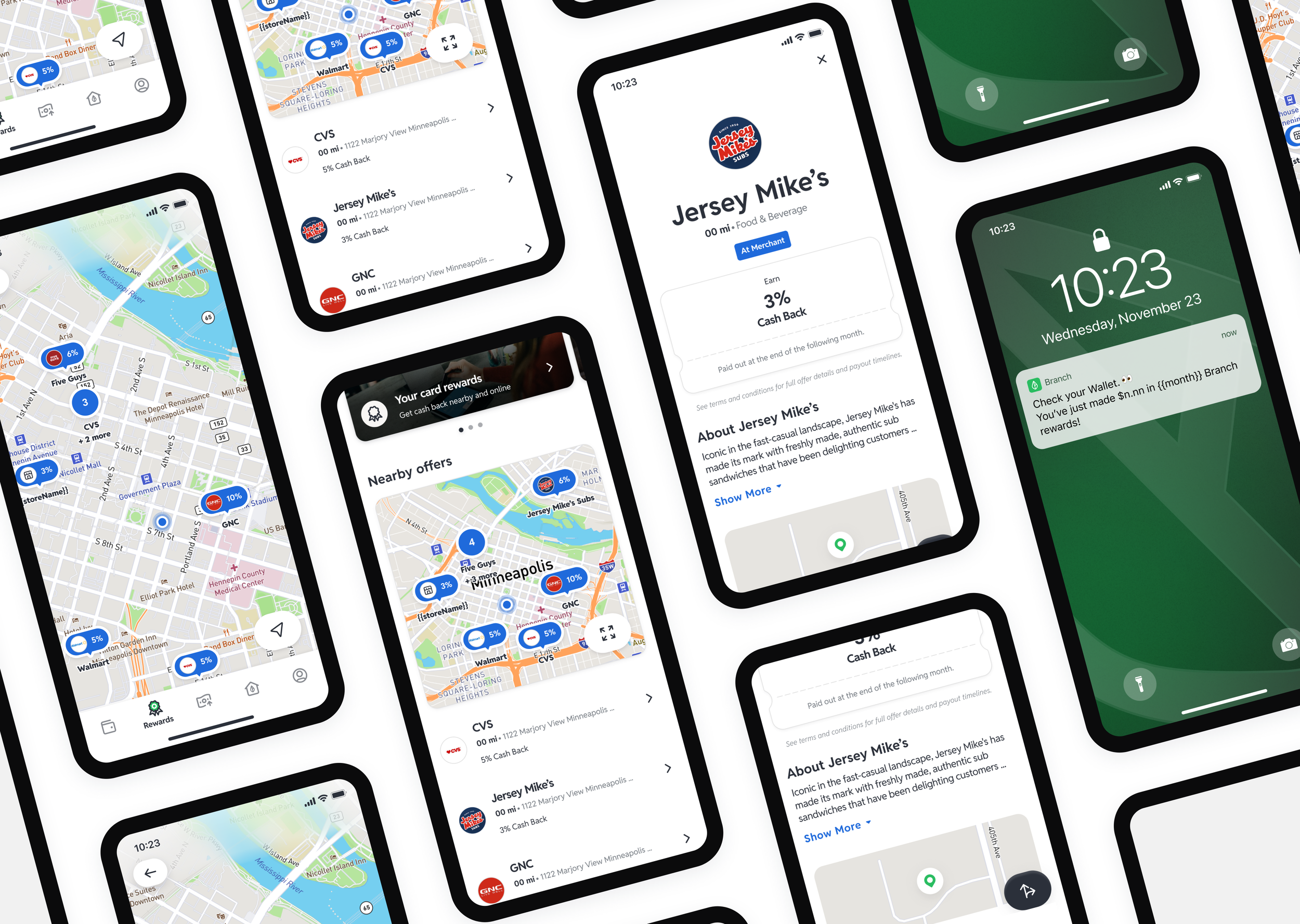
The Branch Rewards tab had a real problem — actually three problems at once. Users weren't tapping into it, the offers that were there were hard to find, and even when users found them, they didn't fully understand what they were getting or how the different reward types worked.
The tab had grown over time without a cohesive structure. Mastercard Easy Savings, Upside, and Kard rewards all lived in the same space with no clear hierarchy. Users were leaving value on the table not because they didn't want rewards, but because the experience didn't surface them clearly enough to act on.
My role
I was the lead designer on the Rewards Revamp, working across Branch and Uber Pro Card surfaces. I collaborated with another team member on a 10-day survey sent to active Branch app users before and after the redesign, which gave us measurable before and after data on discoverability and comprehension.
Two prototypes came out of this project: one for the Branch app and one for the Uber Pro Card experience.
Three decisions that shaped the redesign
Surface the value before asking users to explore
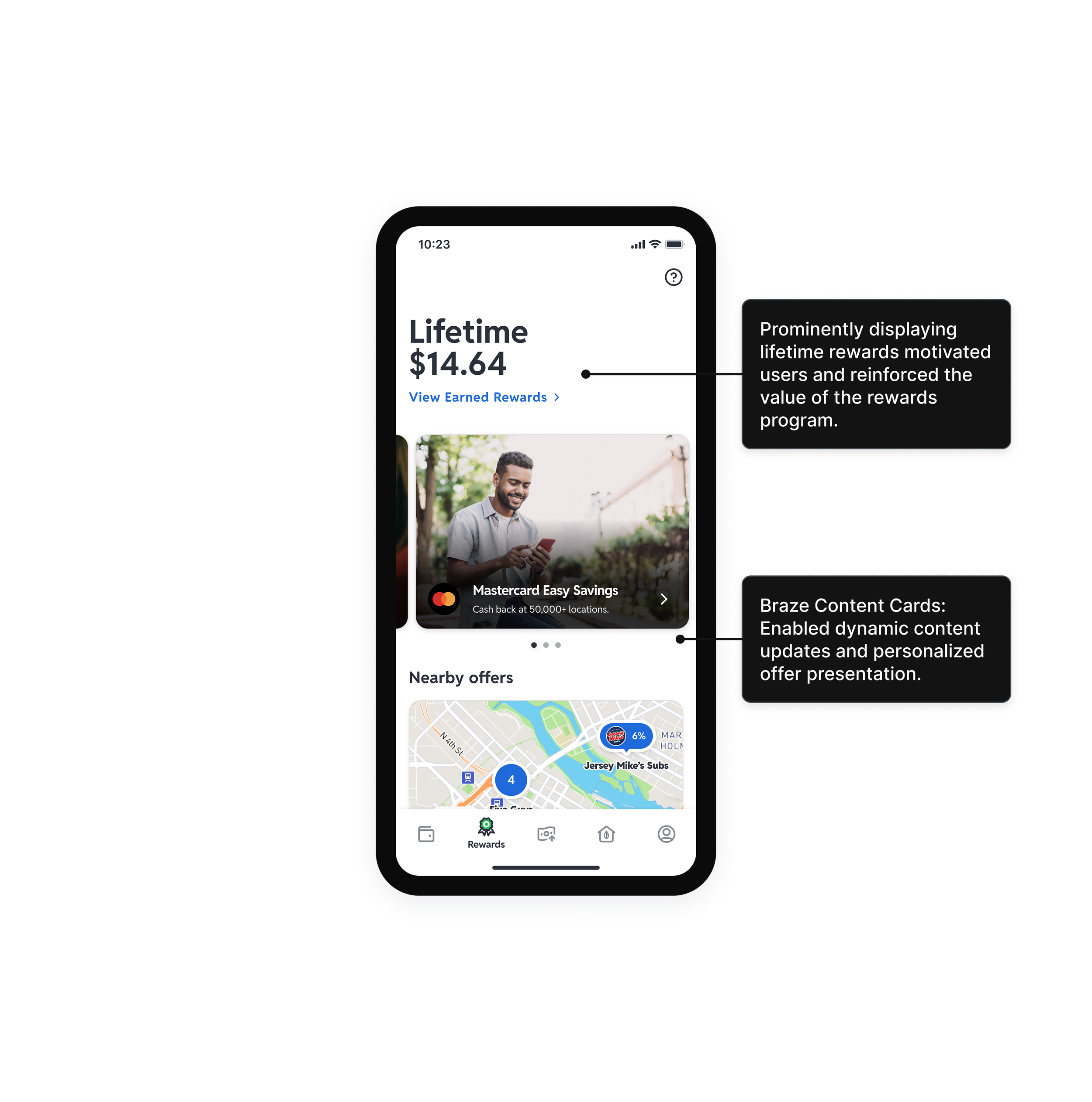
The original tab asked users to browse before showing them why it was worth their time. The redesign led with lifetime rewards earned — a number that made the tab feel immediately relevant. If a user could see they had already earned something, they were more likely to keep going.
Separate the reward types so users could tell them apart
One of the core comprehension problems was that Mastercard Easy Savings, Upside, and Kard offers all looked similar. Users didn't understand that they were different programs with different mechanics. The carousel structure gave each aggregator its own visual lane, which made the distinctions legible without requiring users to read fine print.
Optimize for browsing, not just searching
The original map view was technically functional but visually misaligned with how users expected a map to work. We cleaned up the visual design and added a list view as an alternative for users who preferred to browse rather than explore geographically. The goal was to meet users in whichever mode felt natural to them.


Validation
We ran a 10-day survey with active Branch app users to measure before and after. The results were specific enough to be meaningful:
Offer discoverability improved 65%. User comprehension of how rewards worked improved 64%. Awareness of Mastercard Easy Savings went from 34% to 60%, a 26 point lift. Users described the redesigned experience as cleaner, more rewarding, and easier to navigate.
Outcome
The survey results validated the core hypothesis: users weren't disengaged because they didn't want rewards. They were disengaged because the experience didn't make the value visible. Once it did, engagement followed.
The redesign contributed to approximately $7 more in average rewards earned per active user. That figure is directional rather than exact, but it points in the right direction and aligns with the discoverability improvements the survey captured.
What I learned
Rewards features fail when users can't tell what they're getting. The comprehension problem was just as important as the discoverability problem — you can surface an offer clearly and still lose the user if they don't understand what it means for them. Both had to be solved together, which is why the visual hierarchy and the copy strategy were treated as the same design problem rather than separate ones.