International transfers
Designing an in-app cash pickup experience for international remittances.
— Company
Branch
— Year
2025
— Role
Lead designer
Sending money home should not require leaving the app
A significant portion of Branch's user base are foreign-born workers supporting family members abroad. Their existing options for sending money internationally were slow, expensive, and required stepping outside the Branch ecosystem entirely — often to services with poor UX and hidden fees.
Branch saw an opportunity to integrate MoneyGram's cash pickup network directly into the Branch Wallet. Workers could initiate an international transfer in a few taps, recipients could pick up cash at a MoneyGram location, and the whole flow would live where the money already was.
The MVP focused on Mexico-only transfers to move quickly, validate the concept, and limit operational complexity before expanding.
My role
I was the lead designer on International Transfers, working with product, engineering, compliance, and MoneyGram directly. I started by building out the full user flow before opening Figma, mapping technical and API constraints with the PM before touching any screens. MoneyGram reviewed the initial designs and responded positively.
The project was later put on hold due to compliance complexity, not a design outcome. The work stands as a completed design that reached external validation.
The hardest design problem: fraud prevention without friction
International money transfers are high-stakes. Fraud is a real risk, regulatory requirements are real constraints, and the users sending money are often doing so under time pressure for people who depend on it. Any design that felt slow, confusing, or bureaucratic would cause users to abandon the flow and go back to the legacy services we were trying to replace.
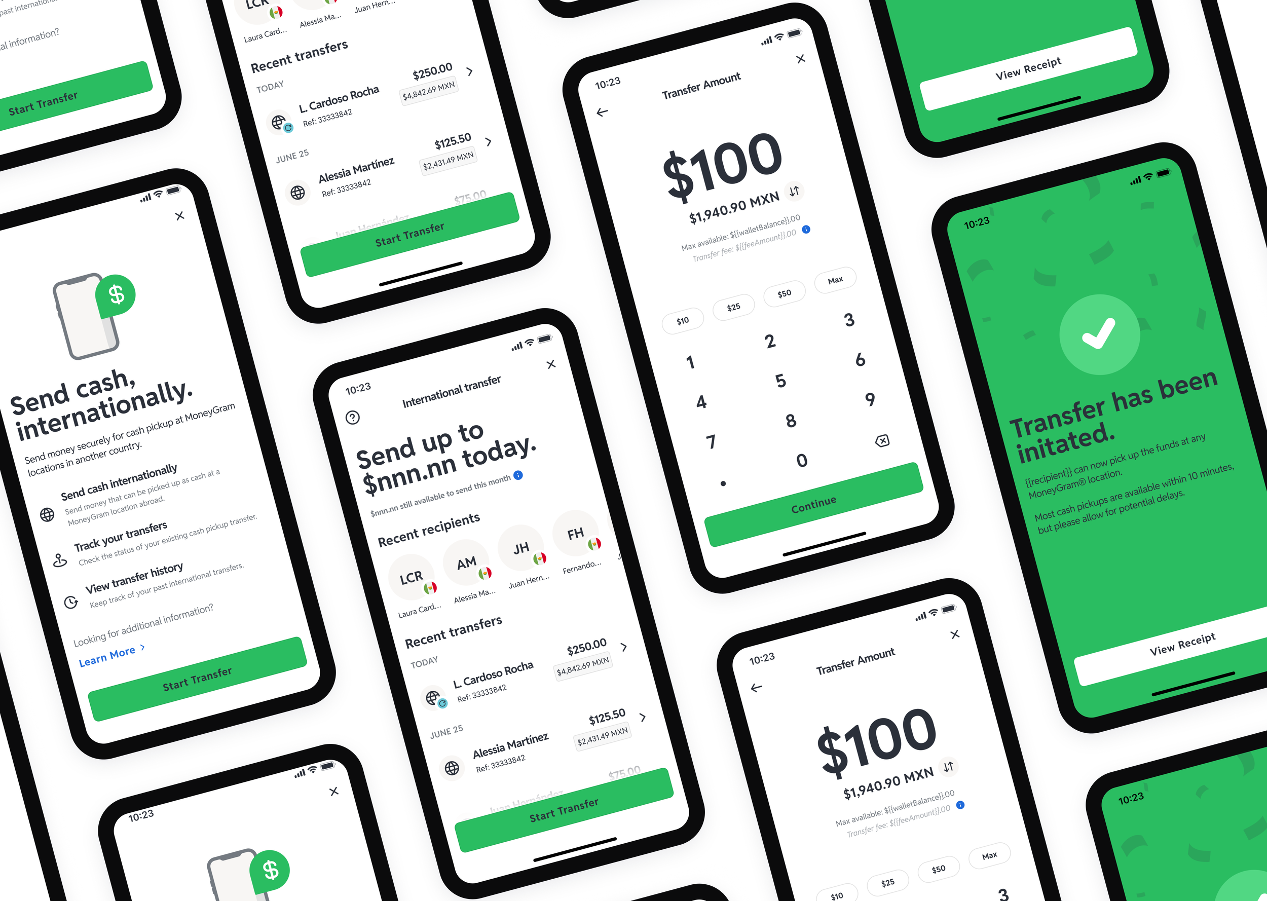
The solution was to front-load the educational and verification steps clearly without making them feel punitive. Identity verification was framed as protection for the sender and recipient, not as a gate. Country-specific rules and fees appeared progressively, only when they were relevant to the specific transfer being made, rather than all upfront. The three-step flow — select recipient, enter amount, review and confirm — was deliberately simple at the top level, with detail surfaced on demand.
The compliance requirements that eventually paused the project were more complex than the UI could absorb cleanly. That tension between regulatory depth and usability is what made this project hard, and it is also what made it worth designing carefully.We designed for clarity and trust in a high-stakes financial flow:


What I learned
High-stakes financial flows require trust at every step, not just at the moment of confirmation. A user sending $200 to their family in Mexico is making a consequential decision. Every screen that felt unclear or unexplained was a potential dropout point. Designing for trust meant treating the educational screens with as much care as the transactional ones — which is where most fintech products cut corners.
What shipped
The designs were completed and reviewed positively by MoneyGram. The project was paused before development due to compliance requirements that introduced more operational complexity than the MVP scope could support.
The Figma prototype covers the full flow: wallet entry point, recipient setup, amount and fee disclosure, confirmation, and transfer success state.